Line@KAF App
Status: Completed app, awaiting launch
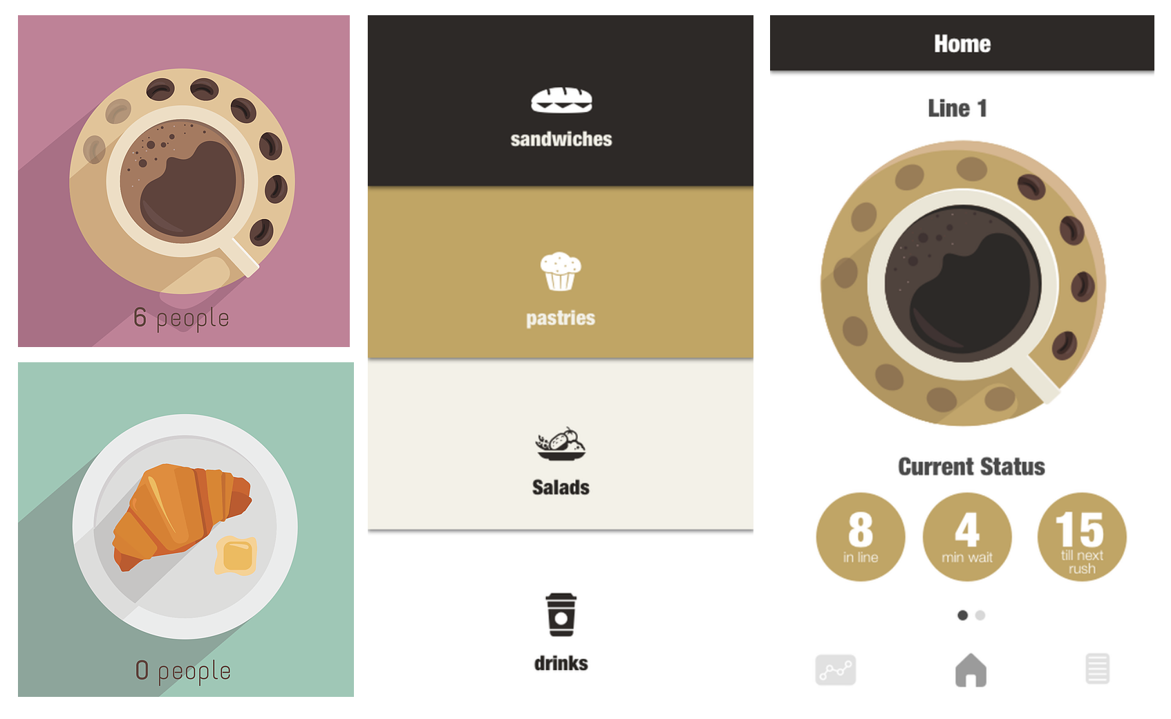
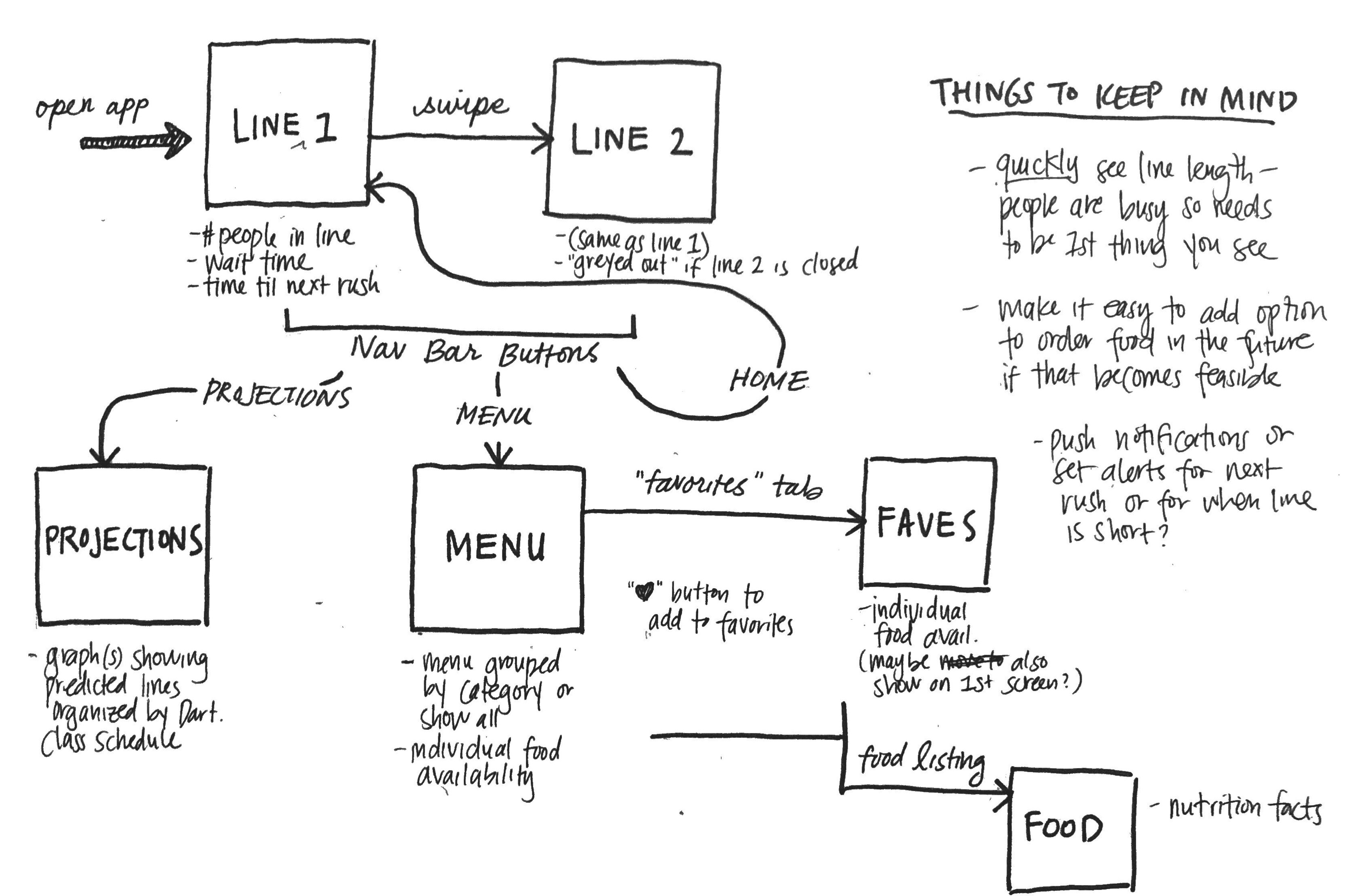
KAF, or King Arthur Flour, is a popular cafe in Dartmouth's Baker Berry library. It is overwhelmingly popular, especially between class periods with 20-minute wait times, that “long KAF line” has become a prevalent campus meme.
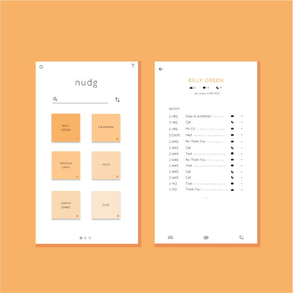
During my Sophomore Summer, I worked on a team with two graduate students who proposed "Line @ KAF", an app that would use video technology to visualize the current line length and predicted upcoming line lengths. Before designing, I interviewed students on campus to figure out what features were highest in demand for the app. As expected, most complained about the line length and the inability to figure out how long the line was without going there in person (or texting friends who were already there). From these interviews, I also found that students were frustrated when they realized the food they wanted was sold out after waiting for a long time (the line blocks the view of the display window, so it's hard to see what's still available). Many also noted that the menu was difficult to read, as it was placed at the front of the line with very small text.
I took these insights into account when figuring out the most important features that this app needed to have. I worked mostly on the illustration and UX side while the other designer on the team focused on the wireframes.
Takeaways
This was my first break into UI/UX design, and while I focused more on the UI side, I started understanding the process of wireframing and prototyping interfaces. This project is in the process of deployment, and the beta version will be out by Fall 2018, woohoo!
User flow sketches
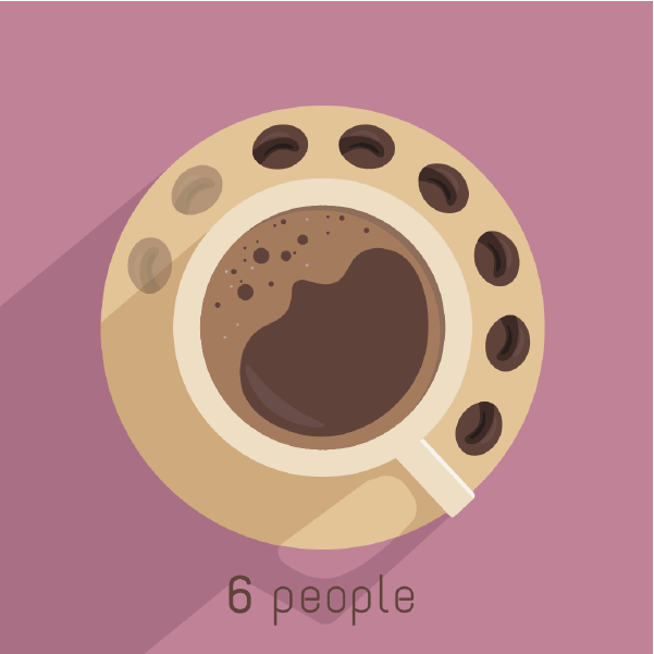
Line visualization and mockup ideas