The Dish.
View our site here.
Status: Launched
Overview
As a design intern at Cogo Labs, I worked on a team with four other interns (two data analysts and two engineers) to create a website from absolute scratch. The theme was “events”, and the end goal was to maximize 10 metrics (such as total visitors, ad CPC, returning visitors, bounce rate).
Timeline
WEEK 1: Researching & Need-Finding
WEEK 2: Landing Page & User Buildup
WEEK 2-3: Wireframing
WEEK 4: Prototyping & User Feedback
WEEK 5: Launch!
WEEK 6-10: Iterating & Adding Features
Research & Need-Finding
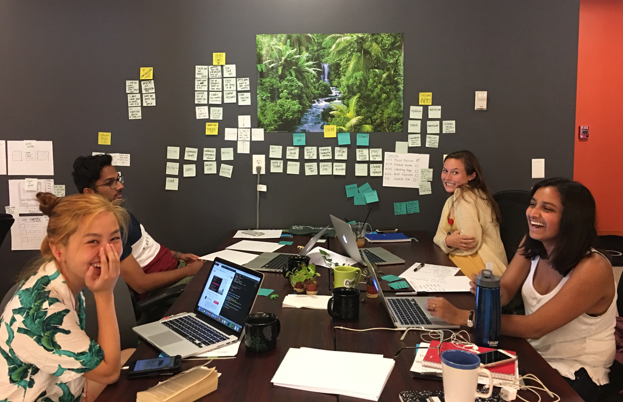
A fun sticky-note brainstorming session with the team to map existing products, current experiences, and user pain points
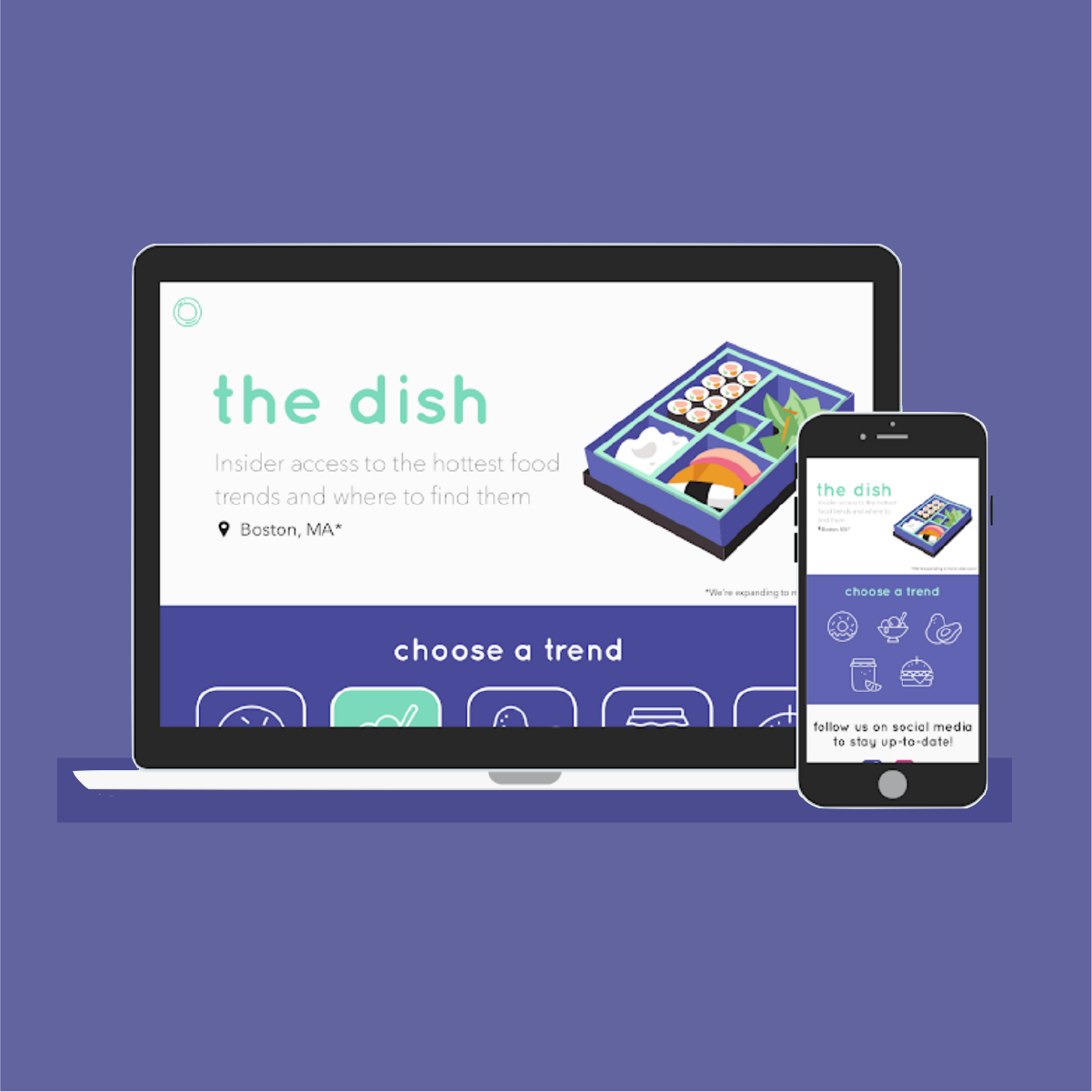
After initial research and interviews and pivoting through a few different ideas, my team decided to build a site that would give foodies insider access to the hottest food trends and where to find them. Our users wanted a sleek user flow that would take the work out of finding these trends and restaurants. So, we created "the dish."
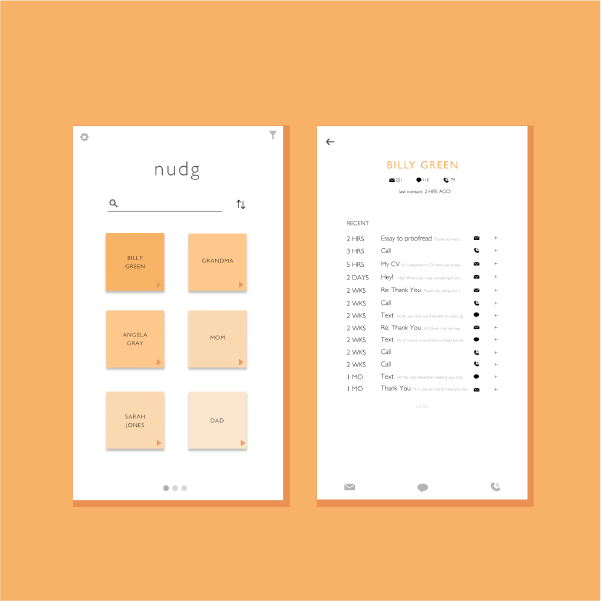
Landing Page & User Base Buildup
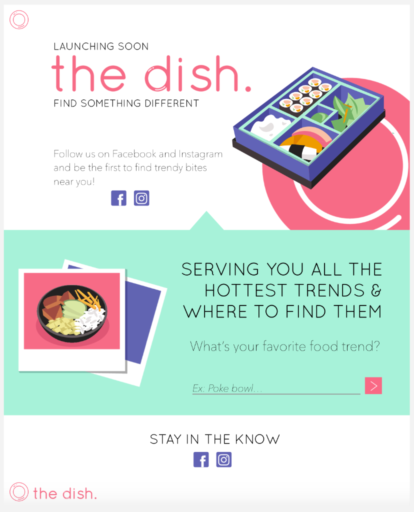
Initial landing page for the dish.
The first step, after deciding our key features for our MVP, was to create a "Coming Soon" landing page to drive traffic. I coded up the front-end of the landing page in HTML/CSS which features our brand, social media links, and a mini entry submission form to measure user engagement.
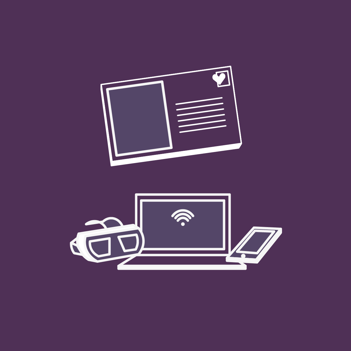
We also launched social media campaigns and generated a user base through our Facebook and Instagram accounts.

We used Instagram to engage with users and build a relationship with trendy restaurants in the area.
Wireframing
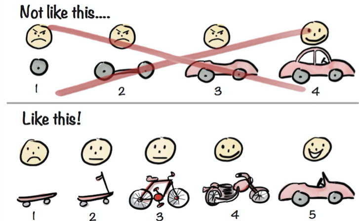
A humbling lesson on building a product that will get better and better with each iteration
In the meantime, I worked on wireframing the MVP site on paper and with Balsamiq. We were inspired by this cartoon that helped us decide that a simple (but working) prototype should be our priority, rather than trying to implement every single feature from the get-go.

Initial wireframing focused on 3 main pages: the landing/home page, the trend page, and the restaurant page
Prototyping & User Testing
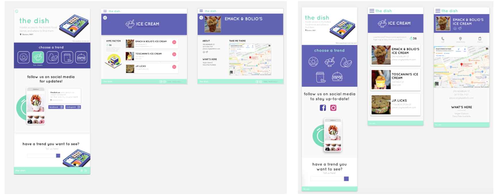
Desktop and mobile high-fidelity mockups of the 3 main pages
Next, I designed the high-fidelity mockups for our site with Sketch and created a prototype to bring to users for initial user testing. I had many takeaways from the testing, such as changing the menu bar location and rethinking the “Hype Factor” feature that measures user engagement/makes the site seem like it’s being used.
I also created a Style Guide to help our engineers as they coded the MVP with React.
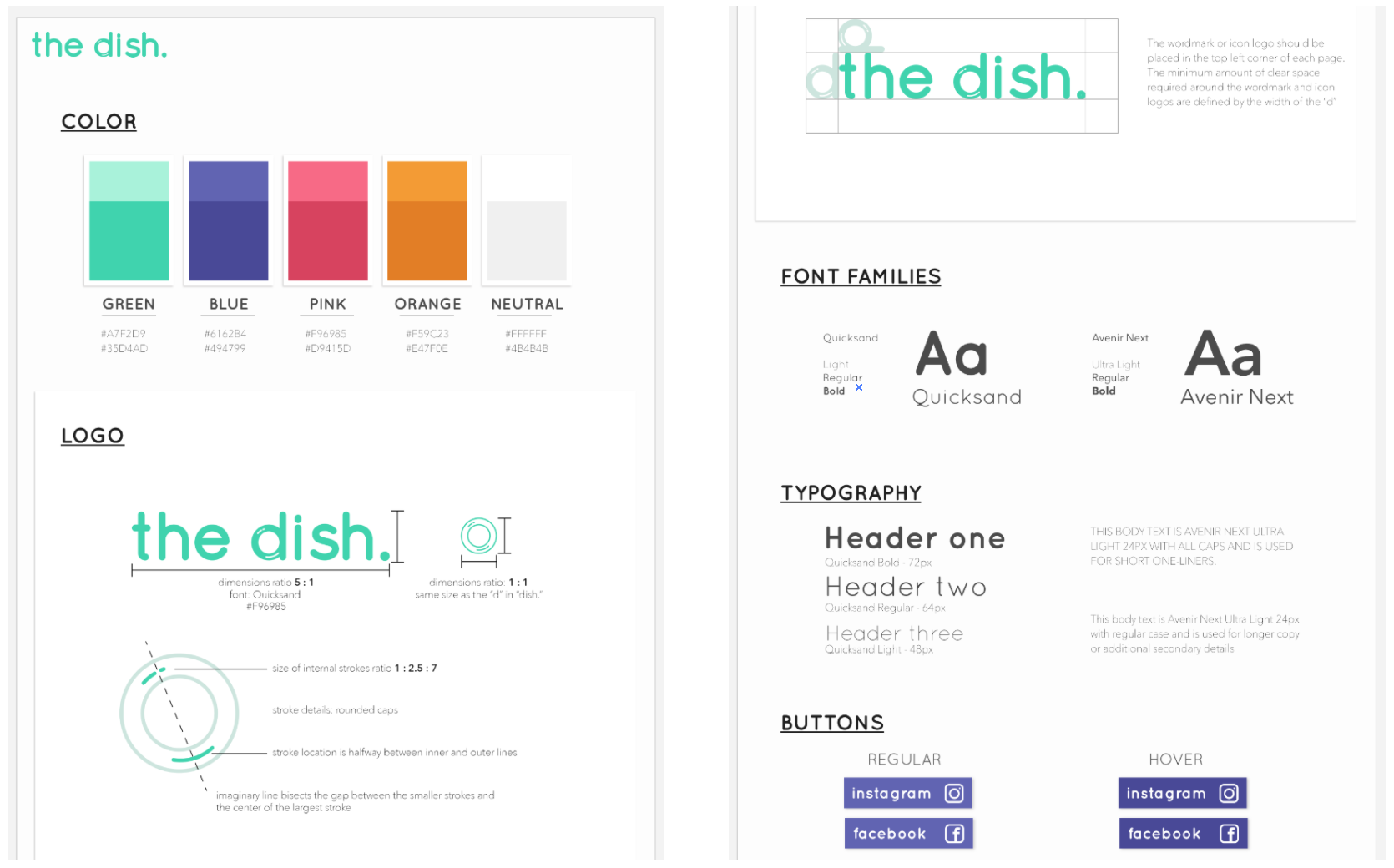
Snippet of the style guide
Launch!

Does this count as work?
With these new changes and a week of implementation (and fun at the beach), we were ready to launch our MVP!
Iterating & Adding Features
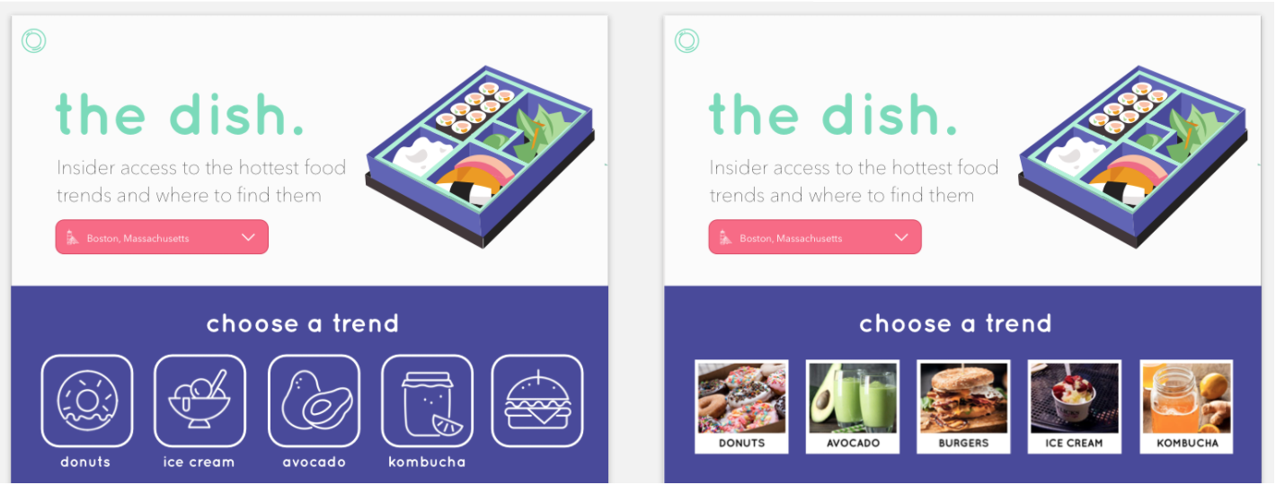
We created this A/B test to see whether users engaged more with illustration icons or photo images
After our launch, we kept iterating and adding additional features using data. Our analysts tracked user flow through Piwik (Matomo), and we brainstormed changes or additions that would enhance experience and increase our metrics. We conducted various A/B tests, such as the one above, to see which would reduce bounce rate.
We also tested various ad campaigns to see which would attract users more, and we further focused our campaigns as we learned from previous CPC results. Granularity was a key word during this phrase since we reached a point where we were able to target more and more specific users to optimize our metrics.
We also A/B tested two styles of ads to see which performed better. The ad on the right ultimately had the lower CPC
I also learned how to use After Effects during some free moments to bring some “moments of delight” with fun animations!

Overall, this was such an amazing summer. I learned so much working with my team and design mentor Maddie, and it’s so cool to see how far our product came. I loved being involved in every aspect of the process - while I was the designer, I still worked with the analysts and engineers to understand what they were doing as well. Cogo is a very data-driven company, and it was neat using the company's resources to inform our decisions. Moving forward, I'm so excited to take the lessons I learned and make some awesome projects in the future.
View our site here.